Kesko Design Tokens are a tech-agnostic way to store variables. We use tokens instead of hard coded values to ensure a better UI consistency across different platforms.
Accent colors #
| Example | Description | Token |
|---|---|---|
4.73:1 {color.orange.800} | Color accent Primary accent color used for interactive elements and theming. | var(--k-color-accent) |
3.01:1 {color.orange.700} | Color accent secondary Secondary accent color used as the default background for secondary interactive elements. | var(--k-color-accent-secondary) |
Background colors #
| Example | Description | Token |
|---|---|---|
1:1 {color.neutral.100} | Color background Base background color used as the default page surface. | var(--k-color-bg) |
1.14:1 {color.neutral.200} | Color background disabled Disabled background color used for disabled controls. | var(--k-color-bg-disabled) |
1.04:1 #fafafa | Color background subtle Subtle background color used as a slightly recessed surface. | var(--k-color-bg-subtle) |
1.08:1 #f6f6f6 | Color background muted Muted background color used as the deepest neutral surface in the color hierarchy. | var(--k-color-bg-muted) |
14.74:1 {color.neutral.1100} | Color background inverted Inverted background color used for high-contrast surfaces. | var(--k-color-bg-inverted) |
1.12:1 {color.orange.200} | Color background hover Hover background color used to indicate interactive hover states. | var(--k-color-bg-hover) |
1.42:1 {color.red.400} | Color background highlight Highlight background color used to draw attention to selected or important content. | var(--k-color-bg-highlight) |
Border colors #
| Example | Description | Token |
|---|---|---|
2.49:1 {color.neutral.600} | Color border Default border color used for static borders and outlines. | var(--k-color-border) |
3.54:1 {color.neutral.700} | Color border active Active border color used to indicate the active or selected state of a bordered element. | var(--k-color-border-active) |
1.82:1 {color.neutral.500} | Color border disabled Disabled border color used for the borders of disabled controls. | var(--k-color-border-disabled) |
6.57:1 {color.red.900} | Color border warning Warning border color used to indicate validation errors and warning states. | var(--k-color-border-warning) |
3.01:1 {color.orange.700} | Color border hover Hover border color used to indicate the hover state of a bordered element. | var(--k-color-border-hover) |
6.62:1 {color.blue.900} | Color border focus Focus border color used to indicate keyboard focus on interactive elements. | var(--k-color-border-focus) |
2.49:1 {color.neutral.600} | Color border divider Divider border color used to separate content sections and list rows. | var(--k-color-border-divider) |
Fill colors #
| Example | Description | Token |
|---|---|---|
1.14:1 {color.neutral.200} | Color fill Default fill color. | var(--k-color-fill) |
1.36:1 {color.neutral.300} | Color fill secondary Secondary fill color. | var(--k-color-fill-secondary) |
1.82:1 {color.neutral.500} | Color fill tertiary Tertiary fill color. | var(--k-color-fill-tertiary) |
15.18:1 {color.purple.1100} | Color fill decorative Decorative fill color used. | var(--k-color-fill-decorative) |
Overlay colors #
| Example | Description | Token |
|---|---|---|
1:1 rgba(255, 255, 255, 0.05) | Color overlay Translucent white overlay applied on top of an interactive surface. Stored as a raw rgba value because alpha overlays cannot be expressed via primitive palette aliases. | var(--k-color-overlay) |
1:1 rgba(0, 0, 0, 0.1) | Color overlay dimmed Translucent black overlay applied on top of an interactive surface. Stored as a raw rgba value because alpha overlays cannot be expressed via primitive palette aliases. | var(--k-color-overlay-dimmed) |
Status colors #
| Example | Description | Token |
|---|---|---|
6.57:1 {color.red.900} | Color status error Background color for solid error messages and badges. | var(--k-color-status-error) |
1.2:1 {color.red.300} | Color status error weak Background color for soft error messages and inline validation surfaces. | var(--k-color-status-error-weak) |
6.62:1 {color.blue.900} | Color status info Background color for solid informational messages and badges. | var(--k-color-status-info) |
1.13:1 {color.blue.200} | Color status info weak Background color for soft informational messages and inline notes. | var(--k-color-status-info-weak) |
1.64:1 {color.yellow.600} | Color status warning Background color for solid warning messages and badges. | var(--k-color-status-warning) |
1.09:1 {color.yellow.200} | Color status warning weak Background color for soft warning messages and inline cautions. | var(--k-color-status-warning-weak) |
6.56:1 {color.green.900} | Color status success Background color for solid success messages and badges. | var(--k-color-status-success) |
1.13:1 {color.green.200} | Color status success weak Background color for soft success messages and confirmation surfaces. | var(--k-color-status-success-weak) |
Text colors #
| Example | Description | Token |
|---|---|---|
14.74:1 {color.neutral.1100} | Color text Default text color used for the main body content. | var(--k-color-text) |
10.7:1 {color.neutral.1000} | Color text weak Weak text color used for supporting copy and slightly de-emphasized content. | var(--k-color-text-weak) |
7.34:1 {color.neutral.900} | Color text weaker Weaker text color used for less emphasized supporting content. | var(--k-color-text-weaker) |
4.61:1 {color.neutral.800} | Color text weakest Weakest text color used for muted helper text and metadata. | var(--k-color-text-weakest) |
3.54:1 {color.neutral.700} | Color text disabled Disabled text color used for the lowest-emphasis text such as disabled labels. | var(--k-color-text-disabled) |
4.73:1 {color.orange.800} | Color text link Link text color that is used for links inside paragraph text. | var(--k-color-text-link) |
4.73:1 {color.orange.800} | Color text accent Accent text color used for branded text and highlighted inline content. | var(--k-color-text-accent) |
14.74:1 {color.neutral.100} | Color text on inverted Foreground color used on top of | var(--k-color-text-on-inverted) |
6.57:1 {color.neutral.100} | Color text on error Foreground color used on top of | var(--k-color-text-on-error) |
15.05:1 {color.red.1200} | Color text on error weak Foreground color used on top of | var(--k-color-text-on-error-weak) |
6.56:1 {color.neutral.100} | Color text on success Foreground color used on top of | var(--k-color-text-on-success) |
16.01:1 {color.green.1200} | Color text on success weak Foreground color used on top of | var(--k-color-text-on-success-weak) |
6.62:1 {color.neutral.100} | Color text on info Foreground color used on top of | var(--k-color-text-on-info) |
16:1 {color.blue.1200} | Color text on info weak Foreground color used on top of | var(--k-color-text-on-info-weak) |
10.97:1 {color.yellow.1200} | Color text on warning Foreground color used on top of | var(--k-color-text-on-warning) |
16.52:1 {color.yellow.1200} | Color text on warning weak Foreground color used on top of | var(--k-color-text-on-warning-weak) |
4.73:1 {color.neutral.100} | Color text on accent Foreground color used for content placed on top of | var(--k-color-text-on-accent) |
3.01:1 {color.neutral.100} | Color text on secondary Foreground color used for content placed on top of | var(--k-color-text-on-secondary) |
4.04:1 {color.neutral.800} | Color text on disabled Foreground color used on top of | var(--k-color-text-on-disabled) |
15.18:1 {color.neutral.100} | Color text on decorative Foreground color used for content placed on top of | var(--k-color-text-on-decorative) |
Brand colors #
| Example | Description | Token |
|---|---|---|
3.01:1 #f86800 | Color brand Kesko orange Kesko brand orange. | var(--k-color-brand-kesko-orange) |
2.42:1 #fd8726 | Color brand Kesko orange inverted Kesko brand orange inverted. | var(--k-color-brand-kesko-orange-inverted) |
21:1 #000000 | Color brand Kesko pure black Kesko pure black. | var(--k-color-brand-kesko-pure-black) |
1:1 #ffffff | Color brand Kesko pure white Kesko pure white. | var(--k-color-brand-kesko-pure-white) |
6.31:1 #c20614 | Color brand K-Citymarket red K-Citymarket brand red. | var(--k-color-brand-kcm-red) |
14.94:1 #570000 | Color brand K-Citymarket dark red K-Citymarket brand dark red. | var(--k-color-brand-kcm-dark-red) |
10.95:1 #800000 | Color brand K-Citymarket warm red K-Citymarket brand warm red. | var(--k-color-brand-kcm-warm-red) |
4.96:1 #e20000 | Color brand K-Citymarket bright red K-Citymarket brand bright red. | var(--k-color-brand-kcm-bright-red) |
1.21:1 #ffed00 | Color brand K-Citymarket outlet K-Citymarket outlet section background yellow. | var(--k-color-brand-kcm-outlet) |
14.64:1 #002855 | Color brand K-Supermarket blue K-Supermarket brand blue. | var(--k-color-brand-ksm-blue) |
7.94:1 #335377 | Color brand K-Supermarket secondary blue K-Supermarket brand secondary blue. | var(--k-color-brand-ksm-secondary-blue) |
8.06:1 #962242 | Color brand K-Market berry K-Market brand berry. | var(--k-color-brand-km-berry) |
11.83:1 #651d32 | Color brand K-Market burgundy K-Market brand burgundy. | var(--k-color-brand-km-burgundy) |
15.18:1 #330072 | Color brand K-Rauta violet K-Rauta brand violet. | var(--k-color-brand-krauta-violet) |
1.82:1 #78d64b | Color brand K-Rauta green K-Rauta brand green. | var(--k-color-brand-krauta-green) |
7.19:1 #54585a | Color brand K-Rauta procenter K-Rauta Procenter brand neutral. | var(--k-color-brand-krauta-procenter) |
14.64:1 #002855 | Color brand Onninen blue Onninen brand blue. | var(--k-color-brand-onninen-blue) |
4.51:1 #00857e | Color brand Onninen teal Onninen brand teal. | var(--k-color-brand-onninen-teal) |
11.52:1 #671f34 | Color brand K-Bygg burgundy K-bygg brand burgundy. | var(--k-color-brand-kbygg-burgundy) |
10.59:1 #384043 | Color brand Byggmakker pro Byggmakker Pro brand neutral. | var(--k-color-brand-byggmakker-pro) |
3.91:1 #5b879a | Color brand Byggmakker blue Byggmakker brand blue. | var(--k-color-brand-byggmakker-blue) |
6.56:1 #b81921 | Color brand Byggmakker red Byggmakker brand red. | var(--k-color-brand-byggmakker-red) |
15.77:1 #1e2233 | Color brand K-Auto dark blue K-Auto brand dark blue. | var(--k-color-brand-kauto-dark-blue) |
1.22:1 #ffe4cb | Color brand K-Auto approval peach K-Auto approval peach. | var(--k-color-brand-kauto-approval-peach) |
7.39:1 #4a566d | Color brand K-Auto campaign K-Auto campaign neutral. | var(--k-color-brand-kauto-campaign) |
2.89:1 #ff6900 | Color brand Kespro primary Kespro brand primary orange. | var(--k-color-brand-kespro-primary) |
15.52:1 #242424 | Color brand K-Business black K-Business brand black. | var(--k-color-brand-kbusiness-black) |
Font families #
| Example | Description | Token |
|---|---|---|
Quick brown fox 'SkattaSansUI', 'SkattaSansUI-fallback', system-ui, sans-serif | Font family sans Skatta Sans UI is the default font family utilized across all Kesko user interfaces. | var(--k-font-family-sans) |
Quick brown fox monospace, monospace | Font family code Monospace typeface for code blocks and development purposes. | var(--k-font-family-code) |
Font weights #
| Example | Description | Token |
|---|---|---|
Quick brown fox {font.weight.regular} | Font weight Default font weight for body text. | var(--k-font-weight) |
Quick brown fox 400 | Font weight regular Default font weight for body text. | var(--k-font-weight-regular) |
Quick brown fox 500 | Font weight medium Default font weight for medium text. | var(--k-font-weight-medium) |
Quick brown fox 700 | Font weight bold Default font weight for bold text. | var(--k-font-weight-bold) |
Quick brown fox 900 | Font weight black Default font weight for black text. | var(--k-font-weight-black) |
Font sizes #
| Example | Description | Token |
|---|---|---|
Quick brown fox 0.625rem | Font size 3XS 10px font size used for the smallest captions and disclaimers. | var(--k-font-size-3xs) |
Quick brown fox 0.75rem | Font size 2XS 12px font size used for small labels, badges, and metadata. | var(--k-font-size-2xs) |
Quick brown fox 0.8125rem | Font size XS 13px font size used as a bridge between the small body and small label scales. | var(--k-font-size-xs) |
Quick brown fox 0.875rem | Font size SM 14px font size used for compact body copy and secondary controls. | var(--k-font-size-sm) |
Quick brown fox 1rem | Font size MD 16px font size used as the default body font size across the system. | var(--k-font-size-md) |
Quick brown fox 1.125rem | Font size LG 18px font size used for emphasized body copy and small headings. | var(--k-font-size-lg) |
Quick brown fox 1.25rem | Font size XL 20px font size used for sub-section headings. | var(--k-font-size-xl) |
Quick brown fox 1.5rem | Font size 2XL 24px font size used for section headings. | var(--k-font-size-2xl) |
Quick brown fox 2rem | Font size 3XL 32px font size used for page-level headings. | var(--k-font-size-3xl) |
Font leading #
| Example | Description | Token |
|---|---|---|
Quick brown fox 1 | Font leading XS Extra small line-height. 1× the used font size. | var(--k-font-leading-xs) |
Quick brown fox 1.25 | Font leading SM Compact line-height. 1.25× the used font size. | var(--k-font-leading-sm) |
Quick brown fox 1.5 | Font leading MD Default body line-height. 1.5× the used font size. | var(--k-font-leading-md) |
Layers #
| Example | Description | Token |
|---|---|---|
1 1 | Layer Default layer used for the default in-flow content stacking context. | var(--k-layer) |
calc(-infinity) calc(-infinity) | Layer lowest Deep layer used for stacking something behind everything else. | var(--k-layer-lowest) |
50 50 | Layer masked Masked layer for masked interface elements. | var(--k-layer-masked) |
100 100 | Layer mask Mask layer for masking masked layers. | var(--k-layer-mask) |
150 150 | Layer sticky Sticky layer used for elements that should appear above the base content, such as sticky headers. | var(--k-layer-sticky) |
200 200 | Layer overlay Overlay layer used for floating UI such as modals, popovers, and toast notifications. | var(--k-layer-overlay) |
calc(infinity) calc(infinity) | Layer highest The highest possibly layer that will always sit on top of everything else. | var(--k-layer-highest) |
Motion #
| Example | Description | Token |
|---|---|---|
50ms | Motion duration XS Extra-small motion duration used for instantaneous micro-feedback such as ripples and tap highlights. | var(--k-motion-duration-xs) |
100ms | Motion duration SM Small motion duration used for snappy state changes such as hover and focus transitions. | var(--k-motion-duration-sm) |
300ms | Motion duration MD Default motion duration used for the majority of UI transitions. | var(--k-motion-duration-md) |
400ms | Motion duration LG Large motion duration used for noticeable transitions such as panel slides and modal entries. | var(--k-motion-duration-lg) |
600ms | Motion duration XL Extra-large motion duration used for prominent choreographed sequences. | var(--k-motion-duration-xl) |
1000ms | Motion duration 2XL XX-large motion duration used for loading animations. | var(--k-motion-duration-2xl) |
ease-out | Motion easing decelerate Standard decelerate easing for elements entering the screen or settling into place. | var(--k-motion-easing-decelerate) |
ease-in | Motion easing accelerate Standard accelerate easing for elements leaving the screen or speeding away. | var(--k-motion-easing-accelerate) |
cubic-bezier(0.05, 0.7, 0.1, 1) | Motion easing decelerate emphasized Emphasized decelerate easing used for prominent entrances and hero transitions. | var(--k-motion-easing-decelerate-emphasized) |
cubic-bezier(0.3, 0, 0.8, 0.15) | Motion easing accelerate emphasized Emphasized accelerate easing used for prominent exits and dismissive gestures. | var(--k-motion-easing-accelerate-emphasized) |
Opacity #
| Example | Description | Token |
|---|---|---|
1 | Opacity Default opacity for fully opaque elements. | var(--k-opacity) |
0.9 | Opacity active Opacity applied to elements in their active (pressed) state. | var(--k-opacity-active) |
0.1 | Opacity overlay dimmed Opacity used for dimmed overlay surfaces such as scrim backgrounds. | var(--k-opacity-overlay-dimmed) |
0.05 | Opacity overlay Opacity used for translucent hover and pressed overlay layers. | var(--k-opacity-overlay) |
Radius #
| Example | Description | Token |
|---|---|---|
{radius.sm} | Radius button Corner rounding for buttons. | var(--k-radius-button) |
{radius.sm} | Radius input Corner rounding for text inputs and select controls. | var(--k-radius-input) |
{radius.xs} | Radius checkbox Corner rounding for checkboxes. | var(--k-radius-checkbox) |
{radius.md} | Radius element Default corner rounding applied to generic elements. | var(--k-radius-element) |
0 | Radius none Square corners with no rounding. | var(--k-radius-none) |
0.125rem | Radius XS Minimal corner rounding used on fine details and compact elements. | var(--k-radius-xs) |
0.25rem | Radius SM Subtle corner rounding used on tags and small inline controls. | var(--k-radius-sm) |
0.5rem | Radius MD Default corner rounding used on most controls and cards. | var(--k-radius-md) |
0.75rem | Radius LG Large corner rounding used for larger surfaces. | var(--k-radius-lg) |
1rem | Radius XL Extra large corner rounding used on prominent containers and modals. | var(--k-radius-xl) |
999px | Radius pill Rounded corners used on pills and fully rounded buttons. | var(--k-radius-pill) |
50% | Radius circle Rounded corners used on circular items such as avatars. | var(--k-radius-circle) |
Shadows #
| Example | Description | Token |
|---|---|---|
0 1px 2px rgba(0, 0, 0, 0.04), 0 1px 4px rgba(0, 0, 0, 0.12) | Shadow Subtle elevation used for resting cards, list items, and toolbars. | var(--k-shadow) |
0 8px 24px 2px rgba(0, 0, 0, 0.04), 0 2px 28px rgba(0, 0, 0, 0.02), 0 4px 4px rgba(0, 0, 0, 0.08) | Shadow float Low floating elevation used for hovered cards and lightly raised surfaces. | var(--k-shadow-float) |
0 20px 32px 2px rgba(0, 0, 0, 0.08), 0 4px 36px rgba(0, 0, 0, 0.04), 0 8px 12px rgba(0, 0, 0, 0.12) | Shadow float high Medium floating elevation used for popovers, dropdowns, and menus. | var(--k-shadow-float-high) |
0 24px 36px 4px rgba(0, 0, 0, 0.12), 0 8px 44px rgba(0, 0, 0, 0.08), 0 12px 16px rgba(0, 0, 0, 0.16) | Shadow float higher High floating elevation used for modals, dialogs, and overlays. | var(--k-shadow-float-higher) |
0 2px 4px -1px rgba(0, 0, 0, 0.05), 0 4px 6px -1px rgba(0, 0, 0, 0.1) | Shadow popover popover shadow. | var(--k-shadow-popover) |
0 4px 2px 0 rgba(0, 0, 0, 0.1) | Shadow switch toggle switch knob shadow. | var(--k-shadow-switch) |
Sizes #
| Example | Description | Token |
|---|---|---|
0.0625rem | Size border Default border width for interface elements. | var(--k-size-border) |
0.125rem | Size border button Border width for interface buttons. | var(--k-size-border-button) |
0.0625rem | Size border badge Border width for interface badges. | var(--k-size-border-badge) |
0.375em | Size spinner SM Small size for interface loading spinners. | var(--k-size-spinner-sm) |
0.5em | Size spinner MD Default size for interface loading spinners. | var(--k-size-spinner-md) |
0.625em | Size spinner LG Large size for interface loading spinners. | var(--k-size-spinner-lg) |
0.875em | Size spinner XL Extra large size for interface loading spinners. | var(--k-size-spinner-xl) |
1.25em | Size spinner 2XL XXL size for interface loading spinners. | var(--k-size-spinner-2xl) |
1rem | Size icon XS Extra small size for icons that renders them in 16×16px. | var(--k-size-icon-xs) |
1.25rem | Size icon SM Small size for icons that renders them in 20×20px. | var(--k-size-icon-sm) |
1.5rem | Size icon MD Medium size for icons that renders them in 24×24px. | var(--k-size-icon-md) |
2rem | Size icon LG Large size for icons that renders them in 32×32px. | var(--k-size-icon-lg) |
3rem | Size icon XL Extra large size for icons that renders them in 48×48px. | var(--k-size-icon-xl) |
Spacing #
| Example | Description | Token |
|---|---|---|
{space.sm} | Space button Button spacing used to calculate inline and block padding for buttons. | var(--k-space-button) |
0.125rem | Space 4XS 2px spacing used for the finest hairline gaps. | var(--k-space-4xs) |
0.25rem | Space 3XS 4px spacing used for tightly packed inline elements. | var(--k-space-3xs) |
0.5rem | Space 2XS 8px spacing used between closely related elements. | var(--k-space-2xs) |
0.625rem | Space XS 10px spacing used between small adjacent elements and inside compact controls. | var(--k-space-xs) |
0.75rem | Space SM 12px spacing used between small adjacent elements and inside compact controls. | var(--k-space-sm) |
1rem | Space MD 16px default spacing used as the base spacing unit across the system. | var(--k-space-md) |
1.5rem | Space LG 24px spacing used between sections within a card or panel. | var(--k-space-lg) |
2rem | Space XL 32px spacing used between major content blocks on a page. | var(--k-space-xl) |
2.5rem | Space 2XL 40px spacing used as a generous separator between distinct page sections. | var(--k-space-2xl) |
3rem | Space 3XL 48px spacing used as the largest standard layout gap. | var(--k-space-3xl) |
Primitives #
| Example | Description | Token |
|---|---|---|
1:1 #ffffff | Color neutral 100 Neutral 100 (generated by @kesko/color). In most cases, you should not use this primitive directly, but use the semantic colors instead that define purpose & intent. | var(--k-color-neutral-100) |
1.14:1 #f0f0f0 | Color neutral 200 Neutral 200 (generated by @kesko/color). In most cases, you should not use this primitive directly, but use the semantic colors instead that define purpose & intent. | var(--k-color-neutral-200) |
1.36:1 #dddddd | Color neutral 300 Neutral 300 (generated by @kesko/color). In most cases, you should not use this primitive directly, but use the semantic colors instead that define purpose & intent. | var(--k-color-neutral-300) |
1.59:1 #cdcdcd | Color neutral 400 Neutral 400 (generated by @kesko/color). In most cases, you should not use this primitive directly, but use the semantic colors instead that define purpose & intent. | var(--k-color-neutral-400) |
1.82:1 #c0c0c0 | Color neutral 500 Neutral 500 (generated by @kesko/color). In most cases, you should not use this primitive directly, but use the semantic colors instead that define purpose & intent. | var(--k-color-neutral-500) |
2.49:1 #a4a4a4 | Color neutral 600 Neutral 600 (generated by @kesko/color). In most cases, you should not use this primitive directly, but use the semantic colors instead that define purpose & intent. | var(--k-color-neutral-600) |
3.54:1 #888888 | Color neutral 700 Neutral 700 (generated by @kesko/color). In most cases, you should not use this primitive directly, but use the semantic colors instead that define purpose & intent. | var(--k-color-neutral-700) |
4.61:1 #757575 | Color neutral 800 Neutral 800 (generated by @kesko/color). In most cases, you should not use this primitive directly, but use the semantic colors instead that define purpose & intent. | var(--k-color-neutral-800) |
7.34:1 #565656 | Color neutral 900 Neutral 900 (generated by @kesko/color). In most cases, you should not use this primitive directly, but use the semantic colors instead that define purpose & intent. | var(--k-color-neutral-900) |
10.7:1 #3e3e3e | Color neutral 1000 Neutral 1000 (generated by @kesko/color). In most cases, you should not use this primitive directly, but use the semantic colors instead that define purpose & intent. | var(--k-color-neutral-1000) |
14.74:1 #282828 | Color neutral 1100 Neutral 1100 (generated by @kesko/color). In most cases, you should not use this primitive directly, but use the semantic colors instead that define purpose & intent. | var(--k-color-neutral-1100) |
21:1 #000000 | Color neutral 1200 Neutral 1200 (generated by @kesko/color). In most cases, you should not use this primitive directly, but use the semantic colors instead that define purpose & intent. | var(--k-color-neutral-1200) |
17.22:1 #1b1b1b | Color neutral dark 100 Neutral Dark 100 (generated by @kesko/color). In most cases, you should not use this primitive directly, but use the semantic colors instead that define purpose & intent. | var(--k-color-neutral-dark-100) |
15.13:1 #262626 | Color neutral dark 200 Neutral Dark 200 (generated by @kesko/color). In most cases, you should not use this primitive directly, but use the semantic colors instead that define purpose & intent. | var(--k-color-neutral-dark-200) |
12.63:1 #333333 | Color neutral dark 300 Neutral Dark 300 (generated by @kesko/color). In most cases, you should not use this primitive directly, but use the semantic colors instead that define purpose & intent. | var(--k-color-neutral-dark-300) |
10.86:1 #3d3d3d | Color neutral dark 400 Neutral Dark 400 (generated by @kesko/color). In most cases, you should not use this primitive directly, but use the semantic colors instead that define purpose & intent. | var(--k-color-neutral-dark-400) |
9.44:1 #464646 | Color neutral dark 500 Neutral Dark 500 (generated by @kesko/color). In most cases, you should not use this primitive directly, but use the semantic colors instead that define purpose & intent. | var(--k-color-neutral-dark-500) |
6.9:1 #5a5a5a | Color neutral dark 600 Neutral Dark 600 (generated by @kesko/color). In most cases, you should not use this primitive directly, but use the semantic colors instead that define purpose & intent. | var(--k-color-neutral-dark-600) |
4.88:1 #717171 | Color neutral dark 700 Neutral Dark 700 (generated by @kesko/color). In most cases, you should not use this primitive directly, but use the semantic colors instead that define purpose & intent. | var(--k-color-neutral-dark-700) |
3.74:1 #848484 | Color neutral dark 800 Neutral Dark 800 (generated by @kesko/color). In most cases, you should not use this primitive directly, but use the semantic colors instead that define purpose & intent. | var(--k-color-neutral-dark-800) |
2.35:1 #a9a9a9 | Color neutral dark 900 Neutral Dark 900 (generated by @kesko/color). In most cases, you should not use this primitive directly, but use the semantic colors instead that define purpose & intent. | var(--k-color-neutral-dark-900) |
1.62:1 #cbcbcb | Color neutral dark 1000 Neutral Dark 1000 (generated by @kesko/color). In most cases, you should not use this primitive directly, but use the semantic colors instead that define purpose & intent. | var(--k-color-neutral-dark-1000) |
1.17:1 #ededed | Color neutral dark 1100 Neutral Dark 1100 (generated by @kesko/color). In most cases, you should not use this primitive directly, but use the semantic colors instead that define purpose & intent. | var(--k-color-neutral-dark-1100) |
1:1 #ffffff | Color neutral dark 1200 Neutral Dark 1200 (generated by @kesko/color). In most cases, you should not use this primitive directly, but use the semantic colors instead that define purpose & intent. | var(--k-color-neutral-dark-1200) |
1.06:1 #fcf8f5 | Color beige 100 Beige 100 (generated by @kesko/color). In most cases, you should not use this primitive directly, but use the semantic colors instead that define purpose & intent. | var(--k-color-beige-100) |
1.12:1 #f6f1ed | Color beige 200 Beige 200 (generated by @kesko/color). In most cases, you should not use this primitive directly, but use the semantic colors instead that define purpose & intent. | var(--k-color-beige-200) |
1.25:1 #ede5dd | Color beige 300 Beige 300 (generated by @kesko/color). In most cases, you should not use this primitive directly, but use the semantic colors instead that define purpose & intent. | var(--k-color-beige-300) |
1.58:1 #dacbbc | Color beige 400 Beige 400 (generated by @kesko/color). In most cases, you should not use this primitive directly, but use the semantic colors instead that define purpose & intent. | var(--k-color-beige-400) |
1.96:1 #c9b6a1 | Color beige 500 Beige 500 (generated by @kesko/color). In most cases, you should not use this primitive directly, but use the semantic colors instead that define purpose & intent. | var(--k-color-beige-500) |
2.42:1 #b9a38c | Color beige 600 Beige 600 (generated by @kesko/color). In most cases, you should not use this primitive directly, but use the semantic colors instead that define purpose & intent. | var(--k-color-beige-600) |
3.01:1 #a7917a | Color beige 700 Beige 700 (generated by @kesko/color). In most cases, you should not use this primitive directly, but use the semantic colors instead that define purpose & intent. | var(--k-color-beige-700) |
4.73:1 #83705c | Color beige 800 Beige 800 (generated by @kesko/color). In most cases, you should not use this primitive directly, but use the semantic colors instead that define purpose & intent. | var(--k-color-beige-800) |
6.62:1 #6a5a4a | Color beige 900 Beige 900 (generated by @kesko/color). In most cases, you should not use this primitive directly, but use the semantic colors instead that define purpose & intent. | var(--k-color-beige-900) |
8.02:1 #5c4e40 | Color beige 1000 Beige 1000 (generated by @kesko/color). In most cases, you should not use this primitive directly, but use the semantic colors instead that define purpose & intent. | var(--k-color-beige-1000) |
15.29:1 #2b241e | Color beige 1100 Beige 1100 (generated by @kesko/color). In most cases, you should not use this primitive directly, but use the semantic colors instead that define purpose & intent. | var(--k-color-beige-1100) |
18.03:1 #191612 | Color beige 1200 Beige 1200 (generated by @kesko/color). In most cases, you should not use this primitive directly, but use the semantic colors instead that define purpose & intent. | var(--k-color-beige-1200) |
1.06:1 #fdf7f7 | Color red 100 Red 100 (generated by @kesko/color). In most cases, you should not use this primitive directly, but use the semantic colors instead that define purpose & intent. | var(--k-color-red-100) |
1.13:1 #fbeeef | Color red 200 Red 200 (generated by @kesko/color). In most cases, you should not use this primitive directly, but use the semantic colors instead that define purpose & intent. | var(--k-color-red-200) |
1.2:1 #f9e6e7 | Color red 300 Red 300 (generated by @kesko/color). In most cases, you should not use this primitive directly, but use the semantic colors instead that define purpose & intent. | var(--k-color-red-300) |
1.42:1 #f5d0d2 | Color red 400 Red 400 (generated by @kesko/color). In most cases, you should not use this primitive directly, but use the semantic colors instead that define purpose & intent. | var(--k-color-red-400) |
1.97:1 #eda6aa | Color red 500 Red 500 (generated by @kesko/color). In most cases, you should not use this primitive directly, but use the semantic colors instead that define purpose & intent. | var(--k-color-red-500) |
2.43:1 #e88d92 | Color red 600 Red 600 (generated by @kesko/color). In most cases, you should not use this primitive directly, but use the semantic colors instead that define purpose & intent. | var(--k-color-red-600) |
3.02:1 #e27378 | Color red 700 Red 700 (generated by @kesko/color). In most cases, you should not use this primitive directly, but use the semantic colors instead that define purpose & intent. | var(--k-color-red-700) |
4.73:1 #d13c44 | Color red 800 Red 800 (generated by @kesko/color). In most cases, you should not use this primitive directly, but use the semantic colors instead that define purpose & intent. | var(--k-color-red-800) |
6.57:1 #b9161e | Color red 900 Red 900 (generated by @kesko/color). In most cases, you should not use this primitive directly, but use the semantic colors instead that define purpose & intent. | var(--k-color-red-900) |
8:1 #a40910 | Color red 1000 Red 1000 (generated by @kesko/color). In most cases, you should not use this primitive directly, but use the semantic colors instead that define purpose & intent. | var(--k-color-red-1000) |
15.25:1 #540001 | Color red 1100 Red 1100 (generated by @kesko/color). In most cases, you should not use this primitive directly, but use the semantic colors instead that define purpose & intent. | var(--k-color-red-1100) |
18.06:1 #370001 | Color red 1200 Red 1200 (generated by @kesko/color). In most cases, you should not use this primitive directly, but use the semantic colors instead that define purpose & intent. | var(--k-color-red-1200) |
1.06:1 #fdf7f0 | Color orange 100 Orange 100 (generated by @kesko/color). In most cases, you should not use this primitive directly, but use the semantic colors instead that define purpose & intent. | var(--k-color-orange-100) |
1.12:1 #fcf0e0 | Color orange 200 Orange 200 (generated by @kesko/color). In most cases, you should not use this primitive directly, but use the semantic colors instead that define purpose & intent. | var(--k-color-orange-200) |
1.25:1 #fae2c4 | Color orange 300 Orange 300 (generated by @kesko/color). In most cases, you should not use this primitive directly, but use the semantic colors instead that define purpose & intent. | var(--k-color-orange-300) |
1.58:1 #f9c48c | Color orange 400 Orange 400 (generated by @kesko/color). In most cases, you should not use this primitive directly, but use the semantic colors instead that define purpose & intent. | var(--k-color-orange-400) |
1.96:1 #fba656 | Color orange 500 Orange 500 (generated by @kesko/color). In most cases, you should not use this primitive directly, but use the semantic colors instead that define purpose & intent. | var(--k-color-orange-500) |
2.42:1 #fd8726 | Color orange 600 Orange 600 (generated by @kesko/color). In most cases, you should not use this primitive directly, but use the semantic colors instead that define purpose & intent. | var(--k-color-orange-600) |
3.01:1 #f86800 | Color orange 700 Orange 700 (generated by @kesko/color). In most cases, you should not use this primitive directly, but use the semantic colors instead that define purpose & intent. | var(--k-color-orange-700) |
4.73:1 #cb4700 | Color orange 800 Orange 800 (generated by @kesko/color). In most cases, you should not use this primitive directly, but use the semantic colors instead that define purpose & intent. | var(--k-color-orange-800) |
6.59:1 #a53900 | Color orange 900 Orange 900 (generated by @kesko/color). In most cases, you should not use this primitive directly, but use the semantic colors instead that define purpose & intent. | var(--k-color-orange-900) |
8:1 #903100 | Color orange 1000 Orange 1000 (generated by @kesko/color). In most cases, you should not use this primitive directly, but use the semantic colors instead that define purpose & intent. | var(--k-color-orange-1000) |
15.27:1 #451700 | Color orange 1100 Orange 1100 (generated by @kesko/color). In most cases, you should not use this primitive directly, but use the semantic colors instead that define purpose & intent. | var(--k-color-orange-1100) |
18.02:1 #2b0e00 | Color orange 1200 Orange 1200 (generated by @kesko/color). In most cases, you should not use this primitive directly, but use the semantic colors instead that define purpose & intent. | var(--k-color-orange-1200) |
1.05:1 #fff9e5 | Color yellow 100 Yellow 100 (generated by @kesko/color). In most cases, you should not use this primitive directly, but use the semantic colors instead that define purpose & intent. | var(--k-color-yellow-100) |
1.09:1 #fff5d2 | Color yellow 200 Yellow 200 (generated by @kesko/color). In most cases, you should not use this primitive directly, but use the semantic colors instead that define purpose & intent. | var(--k-color-yellow-200) |
1.2:1 #ffeaa2 | Color yellow 300 Yellow 300 (generated by @kesko/color). In most cases, you should not use this primitive directly, but use the semantic colors instead that define purpose & intent. | var(--k-color-yellow-300) |
1.3:1 #ffe075 | Color yellow 400 Yellow 400 (generated by @kesko/color). In most cases, you should not use this primitive directly, but use the semantic colors instead that define purpose & intent. | var(--k-color-yellow-400) |
1.44:1 #ffd23f | Color yellow 500 Yellow 500 (generated by @kesko/color). In most cases, you should not use this primitive directly, but use the semantic colors instead that define purpose & intent. | var(--k-color-yellow-500) |
1.64:1 #fcc10f | Color yellow 600 Yellow 600 (generated by @kesko/color). In most cases, you should not use this primitive directly, but use the semantic colors instead that define purpose & intent. | var(--k-color-yellow-600) |
2.31:1 #e19e00 | Color yellow 700 Yellow 700 (generated by @kesko/color). In most cases, you should not use this primitive directly, but use the semantic colors instead that define purpose & intent. | var(--k-color-yellow-700) |
4.2:1 #ab6f00 | Color yellow 800 Yellow 800 (generated by @kesko/color). In most cases, you should not use this primitive directly, but use the semantic colors instead that define purpose & intent. | var(--k-color-yellow-800) |
5.52:1 #935d00 | Color yellow 900 Yellow 900 (generated by @kesko/color). In most cases, you should not use this primitive directly, but use the semantic colors instead that define purpose & intent. | var(--k-color-yellow-900) |
8.06:1 #734600 | Color yellow 1000 Yellow 1000 (generated by @kesko/color). In most cases, you should not use this primitive directly, but use the semantic colors instead that define purpose & intent. | var(--k-color-yellow-1000) |
15.22:1 #372100 | Color yellow 1100 Yellow 1100 (generated by @kesko/color). In most cases, you should not use this primitive directly, but use the semantic colors instead that define purpose & intent. | var(--k-color-yellow-1100) |
18.03:1 #211400 | Color yellow 1200 Yellow 1200 (generated by @kesko/color). In most cases, you should not use this primitive directly, but use the semantic colors instead that define purpose & intent. | var(--k-color-yellow-1200) |
1.06:1 #f5f9f3 | Color green 100 Green 100 (generated by @kesko/color). In most cases, you should not use this primitive directly, but use the semantic colors instead that define purpose & intent. | var(--k-color-green-100) |
1.13:1 #ebf4e8 | Color green 200 Green 200 (generated by @kesko/color). In most cases, you should not use this primitive directly, but use the semantic colors instead that define purpose & intent. | var(--k-color-green-200) |
1.26:1 #daead3 | Color green 300 Green 300 (generated by @kesko/color). In most cases, you should not use this primitive directly, but use the semantic colors instead that define purpose & intent. | var(--k-color-green-300) |
1.58:1 #b6d7a9 | Color green 400 Green 400 (generated by @kesko/color). In most cases, you should not use this primitive directly, but use the semantic colors instead that define purpose & intent. | var(--k-color-green-400) |
1.97:1 #99c586 | Color green 500 Green 500 (generated by @kesko/color). In most cases, you should not use this primitive directly, but use the semantic colors instead that define purpose & intent. | var(--k-color-green-500) |
2.42:1 #7eb567 | Color green 600 Green 600 (generated by @kesko/color). In most cases, you should not use this primitive directly, but use the semantic colors instead that define purpose & intent. | var(--k-color-green-600) |
3.01:1 #66a44c | Color green 700 Green 700 (generated by @kesko/color). In most cases, you should not use this primitive directly, but use the semantic colors instead that define purpose & intent. | var(--k-color-green-700) |
4.73:1 #408225 | Color green 800 Green 800 (generated by @kesko/color). In most cases, you should not use this primitive directly, but use the semantic colors instead that define purpose & intent. | var(--k-color-green-800) |
6.56:1 #306a17 | Color green 900 Green 900 (generated by @kesko/color). In most cases, you should not use this primitive directly, but use the semantic colors instead that define purpose & intent. | var(--k-color-green-900) |
8:1 #275c12 | Color green 1000 Green 1000 (generated by @kesko/color). In most cases, you should not use this primitive directly, but use the semantic colors instead that define purpose & intent. | var(--k-color-green-1000) |
15.28:1 #122b07 | Color green 1100 Green 1100 (generated by @kesko/color). In most cases, you should not use this primitive directly, but use the semantic colors instead that define purpose & intent. | var(--k-color-green-1100) |
18.04:1 #0b1a05 | Color green 1200 Green 1200 (generated by @kesko/color). In most cases, you should not use this primitive directly, but use the semantic colors instead that define purpose & intent. | var(--k-color-green-1200) |
1.06:1 #f3f9fa | Color teal 100 Teal 100 (generated by @kesko/color). In most cases, you should not use this primitive directly, but use the semantic colors instead that define purpose & intent. | var(--k-color-teal-100) |
1.13:1 #e6f3f6 | Color teal 200 Teal 200 (generated by @kesko/color). In most cases, you should not use this primitive directly, but use the semantic colors instead that define purpose & intent. | var(--k-color-teal-200) |
1.25:1 #d2eaef | Color teal 300 Teal 300 (generated by @kesko/color). In most cases, you should not use this primitive directly, but use the semantic colors instead that define purpose & intent. | var(--k-color-teal-300) |
1.59:1 #a3d6df | Color teal 400 Teal 400 (generated by @kesko/color). In most cases, you should not use this primitive directly, but use the semantic colors instead that define purpose & intent. | var(--k-color-teal-400) |
1.96:1 #7ec4d2 | Color teal 500 Teal 500 (generated by @kesko/color). In most cases, you should not use this primitive directly, but use the semantic colors instead that define purpose & intent. | var(--k-color-teal-500) |
2.44:1 #5db2c3 | Color teal 600 Teal 600 (generated by @kesko/color). In most cases, you should not use this primitive directly, but use the semantic colors instead that define purpose & intent. | var(--k-color-teal-600) |
3.01:1 #40a1b4 | Color teal 700 Teal 700 (generated by @kesko/color). In most cases, you should not use this primitive directly, but use the semantic colors instead that define purpose & intent. | var(--k-color-teal-700) |
4.73:1 #1b7e91 | Color teal 800 Teal 800 (generated by @kesko/color). In most cases, you should not use this primitive directly, but use the semantic colors instead that define purpose & intent. | var(--k-color-teal-800) |
6.59:1 #106677 | Color teal 900 Teal 900 (generated by @kesko/color). In most cases, you should not use this primitive directly, but use the semantic colors instead that define purpose & intent. | var(--k-color-teal-900) |
8.05:1 #0b5868 | Color teal 1000 Teal 1000 (generated by @kesko/color). In most cases, you should not use this primitive directly, but use the semantic colors instead that define purpose & intent. | var(--k-color-teal-1000) |
15.19:1 #042a32 | Color teal 1100 Teal 1100 (generated by @kesko/color). In most cases, you should not use this primitive directly, but use the semantic colors instead that define purpose & intent. | var(--k-color-teal-1100) |
18.08:1 #03191e | Color teal 1200 Teal 1200 (generated by @kesko/color). In most cases, you should not use this primitive directly, but use the semantic colors instead that define purpose & intent. | var(--k-color-teal-1200) |
1.07:1 #eff8ff | Color blue 100 Blue 100 (generated by @kesko/color). In most cases, you should not use this primitive directly, but use the semantic colors instead that define purpose & intent. | var(--k-color-blue-100) |
1.13:1 #e8f3fb | Color blue 200 Blue 200 (generated by @kesko/color). In most cases, you should not use this primitive directly, but use the semantic colors instead that define purpose & intent. | var(--k-color-blue-200) |
1.25:1 #d9e8f4 | Color blue 300 Blue 300 (generated by @kesko/color). In most cases, you should not use this primitive directly, but use the semantic colors instead that define purpose & intent. | var(--k-color-blue-300) |
1.59:1 #b9d0e3 | Color blue 400 Blue 400 (generated by @kesko/color). In most cases, you should not use this primitive directly, but use the semantic colors instead that define purpose & intent. | var(--k-color-blue-400) |
1.97:1 #9fbcd6 | Color blue 500 Blue 500 (generated by @kesko/color). In most cases, you should not use this primitive directly, but use the semantic colors instead that define purpose & intent. | var(--k-color-blue-500) |
2.43:1 #88aaca | Color blue 600 Blue 600 (generated by @kesko/color). In most cases, you should not use this primitive directly, but use the semantic colors instead that define purpose & intent. | var(--k-color-blue-600) |
3.02:1 #7298be | Color blue 700 Blue 700 (generated by @kesko/color). In most cases, you should not use this primitive directly, but use the semantic colors instead that define purpose & intent. | var(--k-color-blue-700) |
4.77:1 #4676a6 | Color blue 800 Blue 800 (generated by @kesko/color). In most cases, you should not use this primitive directly, but use the semantic colors instead that define purpose & intent. | var(--k-color-blue-800) |
6.62:1 #295f96 | Color blue 900 Blue 900 (generated by @kesko/color). In most cases, you should not use this primitive directly, but use the semantic colors instead that define purpose & intent. | var(--k-color-blue-900) |
8:1 #18528c | Color blue 1000 Blue 1000 (generated by @kesko/color). In most cases, you should not use this primitive directly, but use the semantic colors instead that define purpose & intent. | var(--k-color-blue-1000) |
15.63:1 #001f5a | Color blue 1100 Blue 1100 (generated by @kesko/color). In most cases, you should not use this primitive directly, but use the semantic colors instead that define purpose & intent. | var(--k-color-blue-1100) |
18.02:1 #00143c | Color blue 1200 Blue 1200 (generated by @kesko/color). In most cases, you should not use this primitive directly, but use the semantic colors instead that define purpose & intent. | var(--k-color-blue-1200) |
1.06:1 #f9f7fb | Color purple 100 Purple 100 (generated by @kesko/color). In most cases, you should not use this primitive directly, but use the semantic colors instead that define purpose & intent. | var(--k-color-purple-100) |
1.12:1 #f4f1f7 | Color purple 200 Purple 200 (generated by @kesko/color). In most cases, you should not use this primitive directly, but use the semantic colors instead that define purpose & intent. | var(--k-color-purple-200) |
1.25:1 #e9e4f0 | Color purple 300 Purple 300 (generated by @kesko/color). In most cases, you should not use this primitive directly, but use the semantic colors instead that define purpose & intent. | var(--k-color-purple-300) |
1.59:1 #d4c9e1 | Color purple 400 Purple 400 (generated by @kesko/color). In most cases, you should not use this primitive directly, but use the semantic colors instead that define purpose & intent. | var(--k-color-purple-400) |
1.96:1 #c3b3d5 | Color purple 500 Purple 500 (generated by @kesko/color). In most cases, you should not use this primitive directly, but use the semantic colors instead that define purpose & intent. | var(--k-color-purple-500) |
2.43:1 #b29ec9 | Color purple 600 Purple 600 (generated by @kesko/color). In most cases, you should not use this primitive directly, but use the semantic colors instead that define purpose & intent. | var(--k-color-purple-600) |
3.01:1 #a28bbe | Color purple 700 Purple 700 (generated by @kesko/color). In most cases, you should not use this primitive directly, but use the semantic colors instead that define purpose & intent. | var(--k-color-purple-700) |
4.73:1 #8565aa | Color purple 800 Purple 800 (generated by @kesko/color). In most cases, you should not use this primitive directly, but use the semantic colors instead that define purpose & intent. | var(--k-color-purple-800) |
6.56:1 #704c9c | Color purple 900 Purple 900 (generated by @kesko/color). In most cases, you should not use this primitive directly, but use the semantic colors instead that define purpose & intent. | var(--k-color-purple-900) |
8.05:1 #643c93 | Color purple 1000 Purple 1000 (generated by @kesko/color). In most cases, you should not use this primitive directly, but use the semantic colors instead that define purpose & intent. | var(--k-color-purple-1000) |
15.18:1 #330072 | Color purple 1100 Purple 1100 (generated by @kesko/color). In most cases, you should not use this primitive directly, but use the semantic colors instead that define purpose & intent. | var(--k-color-purple-1100) |
18.01:1 #20004c | Color purple 1200 Purple 1200 (generated by @kesko/color). In most cases, you should not use this primitive directly, but use the semantic colors instead that define purpose & intent. | var(--k-color-purple-1200) |
Usage #
Installation #
To install Kesko Design Tokens as a dependency in your project, run:
npm install @kesko/tokenspnpm add @kesko/tokensyarn add @kesko/tokensbun add @kesko/tokensCSS usage #
Import the stylesheet once at the root of your application. This exposes all design tokens as CSS custom properties:
import "@kesko/tokens/dist/tokens.css";Or, if you prefer to load it directly from HTML:
<link rel="stylesheet" href="/tokens.css" />Then reference any design token in your CSS:
.selector {
  color: var(--k-color-text-success);
  background: var(--k-color-status-success);
  font-family: var(--k-font-family-sans);
}
SCSS usage #
Import the SCSS file at the start of your stylesheet to expose design tokens as $-prefixed Sass variables:
@use "@kesko/tokens/dist/tokens.scss" as *;

.my-button {
  color: $k-color-text-success;
  background: $k-color-status-success;
  font-family: $k-font-family-sans;
}
Less usage #
Import the LESS file to expose design tokens as @-prefixed variables:
@import "@kesko/tokens/dist/tokens.less";

.my-button {
  color: @k-color-text-success;
  background: @k-color-status-success;
  font-family: @k-font-family-sans;
}
JavaScript usage #
Each design token is available as a named export in PascalCase:
import { KColorAccent, KFontFamilySans } from "@kesko/tokens";

element.style.background = KColorAccent;
element.style.fontFamily = KFontFamilySans;
For richer metadata, import the ES module instead. Unlike tokens.js, the ES module has a single default export with each leaf wrapped in a metadata object:
import tokens from "@kesko/tokens/dist/tokens.esm.js";

console.log(tokens.color.accent);

// Outputs:
//
// {
//   key: "{color.accent}",
//   value: "#f86800",
//   comment: "The primary brand accent color used for theming purposes. Aliases `color.orange.700` in the base Kesko theme.",
//   type: "color",
//   filePath: "src/color/accent.yaml",
//   isSource: true,
//   original: {
//     value: "{color.orange.700}",
//     comment: "The primary brand accent color used for theming purposes. Aliases `color.orange.700` in the base Kesko theme.",
//     type: "color",
//     key: "{color.accent}",
//   },
//   name: "accent",
//   attributes: {},
//   path: ["color", "accent"],
// }
TypeScript usage #
Type definitions ship as tokens.d.ts and are referenced by the types field in package.json, so the named exports are typed automatically:
import { KColorAccent, KFontFamilySans } from "@kesko/tokens";The package also exports a DesignToken interface that describes the metadata-rich entries used in the ESM output:
import type { DesignToken } from "@kesko/tokens";

const accent: DesignToken = {
  value: "#f86800",
  type: "color",
  name: "KColorAccent",
};
JSON usage #
For tooling, code generation, or non-JavaScript environments, import the full tree as JSON. The output follows the W3C Design Tokens Community Group format:
import tokens from "@kesko/tokens/dist/tokens.json";

const accent = tokens.color.accent["[default]"];
// {
//   $value: "{color.orange.800}",  // alias preserved; literal for literals
//   $type: "color",
//   $description: "Primary accent color used for interactive elements and theming.",
//   $extensions: {
//     "com.amazon.style-dictionary": {
//       name: "k-color-accent",     // `[default]` sentinel stripped per the kesko/name convention
//       path: ["color", "accent", "[default]"],
//       attributes: { category: "color", type: "accent", item: "[default]" },
//       original: { value: "{color.orange.800}", type: "color", … }
//     }
//   }
// }
The $extensions["design.kesko"] namespace surfaces any non-DTCG-core fields authored in the YAML source. Today, surface on each color/text/on-* token, pairing the foreground with its expected background for contrast checks.
iOS usage #
The ios.swift output exposes the full color palette as UIColor static constants on a KeskoTokens class. Drop dist/ios.swift into your Xcode project and reference design tokens directly:
import UIKit

label.textColor = KeskoTokens.kColorTextBase
view.backgroundColor = KeskoTokens.kColorAccent
From SwiftUI, bridge the UIColor constants with Color(uiColor:):
import SwiftUI

Text("Hello")
  .foregroundColor(Color(uiColor: KeskoTokens.kColorTextBase))
  .background(Color(uiColor: KeskoTokens.kColorAccent))
Android usage #
The android.xml output exposes color resources following standard Android resource naming. Copy dist/android.xml into your project’s res/values/ directory (typically as colors.xml) and reference tokens from layouts and styles:
<TextView
  android:textColor="@color/k_color_text_base"
  android:background="@color/k_color_accent"
  android:text="Hello" />
From Kotlin or Java, use the standard resource lookup:
val accent = ContextCompat.getColor(context, R.color.k_color_accent)Naming #
All design tokens are prefixed with k to prevent conflicts with other libraries. The exact format varies by platform, as described here:
| Platform | Format | Example |
|---|---|---|
| CSS | --k-{path} | --k-color-accent |
| SCSS | $k-{path} | $k-color-accent |
| LESS | @k-{path} | @k-color-accent |
| JavaScript / ESM | K{PascalPath} | KColorAccent |
| TypeScript | K{PascalPath} | KColorAccent |
| JSON | nested object tree | tokens.color.accent |
| iOS Swift | KeskoTokens.k{camelPath} | KeskoTokens.kColorAccent |
| Android XML | k_{snake_path} | k_color_accent |
See the naming guidelines for the complete rules.
Available formats #
The package ships 9 platform-specific formats:
- CSS Custom Properties:
@kesko/tokens/dist/tokens.css - SCSS:
@kesko/tokens/dist/tokens.scss - LESS:
@kesko/tokens/dist/tokens.less - JavaScript (named exports):
@kesko/tokens/dist/tokens.js - ES Module (default tree):
@kesko/tokens/dist/tokens.esm.js - TypeScript declarations:
@kesko/tokens/dist/tokens.d.ts - JSON:
@kesko/tokens/dist/tokens.json - iOS Swift:
@kesko/tokens/dist/ios.swift - Android XML:
@kesko/tokens/dist/android.xml
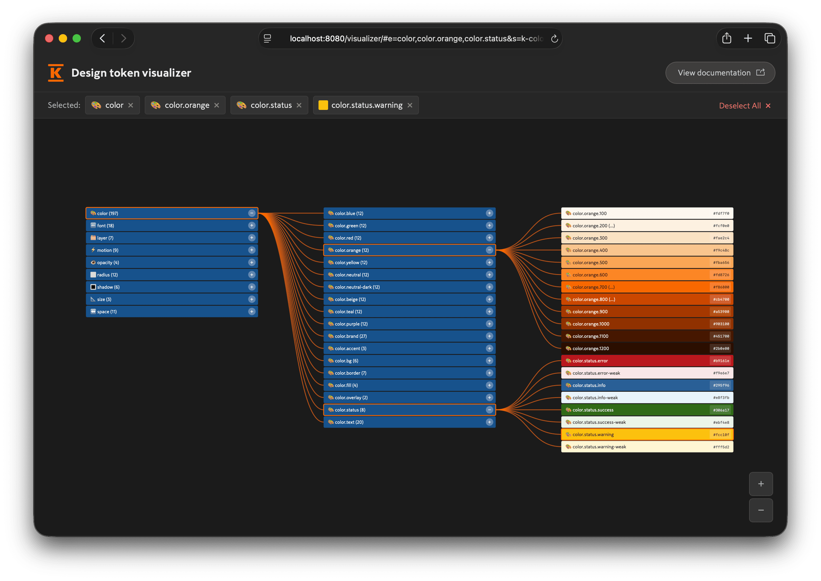
Design token visualizer #
The design token visualizer is an interactive tool for exploring the full Kesko design token tree and understanding how the relationships work between groups, primitives, semantics, themes, and modes.