This guide will help you understand how to transition an existing project from using an older version of Kesko Design System’s icons to using the latest 2.0.0 version.
What’s changing? #
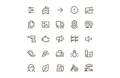
The latest version of Kesko Design System’s icons is a major refresh. Every icon’s artwork has been redrawn on a shared 24×24 grid using consistent 1.5 px strokes, matching corner radii, and the stylistic gap that gives Kesko iconography its character.
The redraw brings the whole library back into one visual family, and the new naming and iconography guidelines keep it that way as the set grows. For most projects this is a drop-in upgrade.
The package name, the import paths and the React API are all unchanged, so the work on your side is updating the dependency, renaming a handful of icons, swapping the four removed duplicates for the icons that replace them, and giving your screens a quick visual check.
Updating dependencies #
To migrate your application to use the latest Kesko Design System icons, update package.json with the necessary dependencies:
- Update existing
@kesko/iconographyto version2.0.0.
Here’s an example package.json:
{
  "dependencies": {
    "@kesko/iconography": "^2.0.0"
  }
}
Nothing else in your integration needs to change. The index module, the individual dist/assets/{name}.js modules, the raw SVG files and the React components all keep their current paths, props and behaviour.
TypeScript and import paths #
Alongside the redraw, 2.0.0 fixes three long-standing problems in how the package describes itself to TypeScript and to bundlers. None of them change what the icons render, so there is nothing to migrate here. They are worth knowing about because each one may have been costing you a workaround on 1.x.
Strict TypeScript on React 19 #
The React declarations used to type every icon as returning JSX.Element, relying on a global namespace that @types/react 19 removed. A strict project on React 19 got an error for every icon in the set:
error TS2503: Cannot find namespace 'JSX'.The declarations now return ReactElement imported from react, which resolves the same way on @types/react 17, 18 and 19. If you added "skipLibCheck": true to your tsconfig.json to silence this, you can drop it:
  {
    "compilerOptions": {
-     "skipLibCheck": true
    }
  }
Leaving it in place is harmless, but it also hides genuine type errors in every other dependency you have, so it’s worth removing if this package was the reason it went in.
Reading the package manifest #
Some build tools resolve @kesko/iconography/package.json to read the manifest, typically to check the installed version. That path is now exported, so those tools work instead of failing with ERR_PACKAGE_PATH_NOT_EXPORTED.
Breaking changes #
We’ve renamed the following icons for better consistency across the icon library. If you’re using any of these icons, you should search and replace their names so that they continue working after the update:
| 1.x | 2.0.0 |
|---|---|
delivery-fast | delivery-express |
delivery-normal | delivery-home |
lightning | lighting |
method-pickup | delivery-pickup |
method-pickup-2 | delivery-pickup-2 |
method-pickup-3 | delivery-pickup-3 |
method-pickup-4 | delivery-pickup-box |
user-normal | user |
work-and-protectice-clothing | protective-clothing |
A rename affects every way an icon can be referenced, so it’s worth checking all of them:
  // Individual React components: the component name and the file name change
- import IconDeliveryFast from "@kesko/iconography/dist/react/IconDeliveryFast.js";
+ import IconDeliveryExpress from "@kesko/iconography/dist/react/IconDeliveryExpress.js";

  // The Icon component: the name prop changes
- <Icon name="method-pickup" />
+ <Icon name="delivery-pickup" />

  // ES modules and raw SVG files: the file name changes
- import svg from "@kesko/iconography/dist/assets/lightning.js";
+ import svg from "@kesko/iconography/dist/assets/lighting.js";
Removed icons #
Four icons were duplicates, meaning the same artwork shipped twice under two names. Each has been removed in favour of the one we kept, and the replacement is visually identical, so swapping the name is the whole migration:
| Removed | Use instead |
|---|---|
attention-extra | notice |
household | home-accessories |
profile | user |
web-store | cart |
The search terms from each removed icon were folded into the one that replaces it, so the icon you want still comes up on the icons page when you search for the old name.
New categories #
The category taxonomy has been redesigned to better match the structure of the updated icon library. This only affects code that reads icon metadata. If you previously never read dist/icons.json or dist/icons.js, there is nothing you need to change. New categories introduced (label + slug):
- Basic UI:
basic-ui - Arrows:
arrows - Lists and filters:
filters - Graphs:
graphs - Editing:
editing - Notifications and alerts:
alerts - Search:
search - Passwords and safety:
security - Location and navigation:
location - Contact and feedback:
contact - People:
people - Shops and shopping:
shopping - Pick-up and delivery:
delivery - Groceries:
groceries - Seasons and campaigns:
seasons - Finance and contracts:
finance - Loyalty programs:
loyalty - Hardware and renovation:
hardware - Home and garden:
home - Shopping categories and services:
services - Automotive:
automotive - Environment and sustainability:
sustainability - Electronics and telecom:
electronics - Logos:
logos
New icons #
The following icons are new in 2.0.0. You can browse them, and the rest of the library, on the icons page:
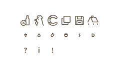
alcohol(groceries)chicken(groceries)contentful(logos)copy-2(editing)exclamation-mark(alerts)info-mark(alerts)question-mark(alerts)roof(hardware)save(editing)fueltype-diesel-sm(automotive)fueltype-electric-sm(automotive)fueltype-gas-sm(automotive)fueltype-hybrid-sm(automotive)fueltype-natural-gas-sm(automotive)fueltype-plug-sm(automotive)
Size-specific variants #
Some icons are drawn for one specific size instead of being scaled down from the 24×24 grid. These carry a -sm suffix and are intended to render at 10×10 px, where a full-detail icon would lose its shape:
import { Icon } from "@kesko/iconography/dist/react/index.js";

<Icon name="fueltype-electric-sm" size={10} label="Electric" />;
Use the regular variant everywhere else. These icons are drawn as solid, heavy shapes so that they hold up at 10 px, which means one rendered at 24 px looks thick and oversized next to the fine 1.5 px strokes around it. The icons page displays these variants at their intended size, so what you see there is what you should get.
Naming guidelines #
Icon names describe what an icon represents, not how it looks or where it’s used, and follow a {name}-{variant}-{suffix} structure. Names are nouns rather than verbs, context free, at most three words, and pronounceable so that teams can talk about them.
That’s the reasoning behind the renames above: method-pickup became delivery-pickup because those icons belong to the same concept as the other delivery icons and should sort and read together, and work-and-protectice-clothing was both misspelled and longer than it needed to be.
See the naming guidelines for the full set of rules.
Iconography guidelines #
The redraw follows a documented drawing standard. It’s worth a skim even if you never draw an icon yourself, because it explains what changed visually:
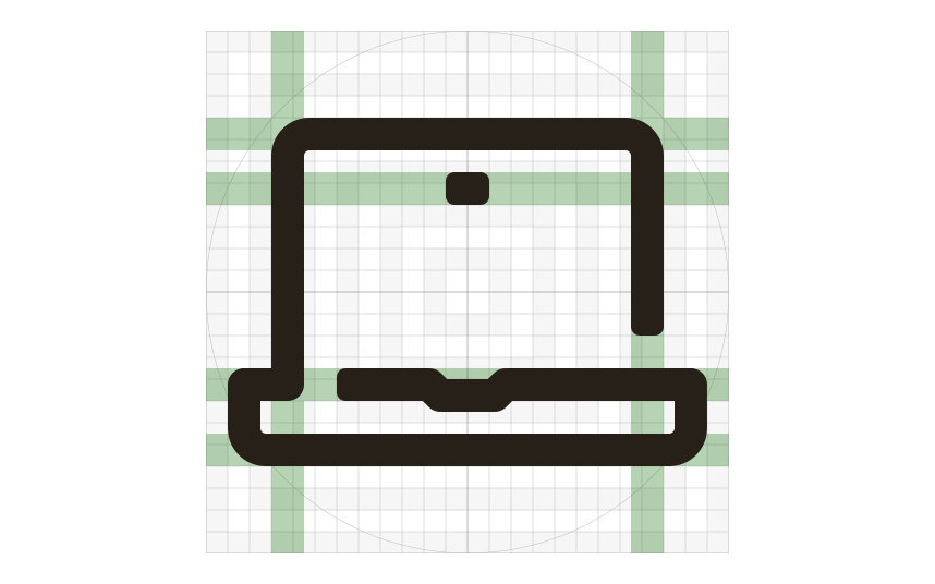
- Icons are line icons built from 1.5 px strokes on a 24×24 grid with 1 px of padding, so they keep their scale and the space around them when exported.
- Outer corners are rounded, with a standard radius of 0.75 px, half the stroke weight. Stroke ends get 0.4 px of rounding.
- Each icon carries one stylistic gap in a stroke, cut horizontally or vertically, or at a 45° angle on circular shapes.
- Stroke edges are aligned to pixel gridlines, so icons render crisply on lower resolution screens.
- Letterforms inside an icon always use Skatta Sans Black, never another typeface.
Getting support #
Have a question about migration to 2.0.0? Please head over to the Support page for more guidelines and ways to contact us.